Ashleigh Roberts
From Pencil To Print
This is the process in which I usually create my art, put as simply as possibly. I usually work on letter (8.5in x 11in) size paper at at least 300ppi in either Photoshop or Clip Studio Paint or both.
Step 1 - PENCIL
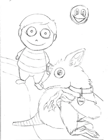
Non-digital option: I draw the initial sketch. I try not to draw too roughly to prevent leaving any pencil markings that'll be difficult to erase when I do step 2.
Digital option: I'll draw the pencil sketch on the bottom-most layer.
Step 2 - PEN/VECTOR LINES

Non-digital option: I prefer to use non-smudge pens (MICRON pens of various sizes). Once I'm done I'll erase all the pencil from the paper. I then scan the image onto my computer.
Digital option: I then draw pen or vector lines (for nice, clean lines) on a new layer on top of the pencil layer. I'll hide the pencil layer afterwards since it's no longer
needed and only used as reference. If I'm adding any monochrome (black and white) patterns, I'll usually add them now as well.
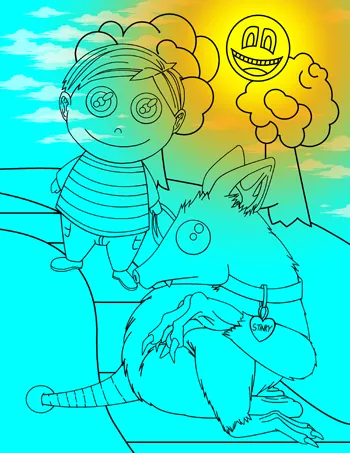
Step 3 - BASIC COLOR
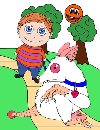
Non-digital option: On the scanned image, I'll change the threshold to make the image strictly black and white (NO grey) before coloring. I'll also need to make all the white
transparent.
It's all digital From Here: I add flat, basic colors onto a new layer beneath the pen, vectors, and pattern layers.
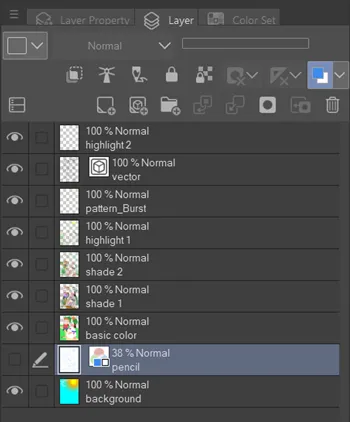
Layers Example
Step 4 - SHADING
I create a new layer directly on top of the basic color layer for the shading. I usually use a darker hue of the basic color that I'm trying to shade over (sometimes I create more then one shading layer, keeping the darkest shade on top).
BACKGROUND LAYER (OPTIONAL)
This is also where I'd add a background layer if I wanted and place it as the bottom-most layer.
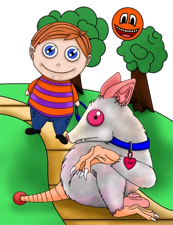
Step 5 - HIGHLIGHTING
I create a new layer directly on top of the top-most shading layer for the highlighting. I use a lighter hue of the basic color that I'm trying to highlight over or sometimes just strictly white. Sometimes the highlights have to be on top of the pen/vector layer.
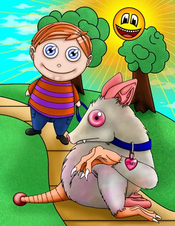
Step 6 - FINAL
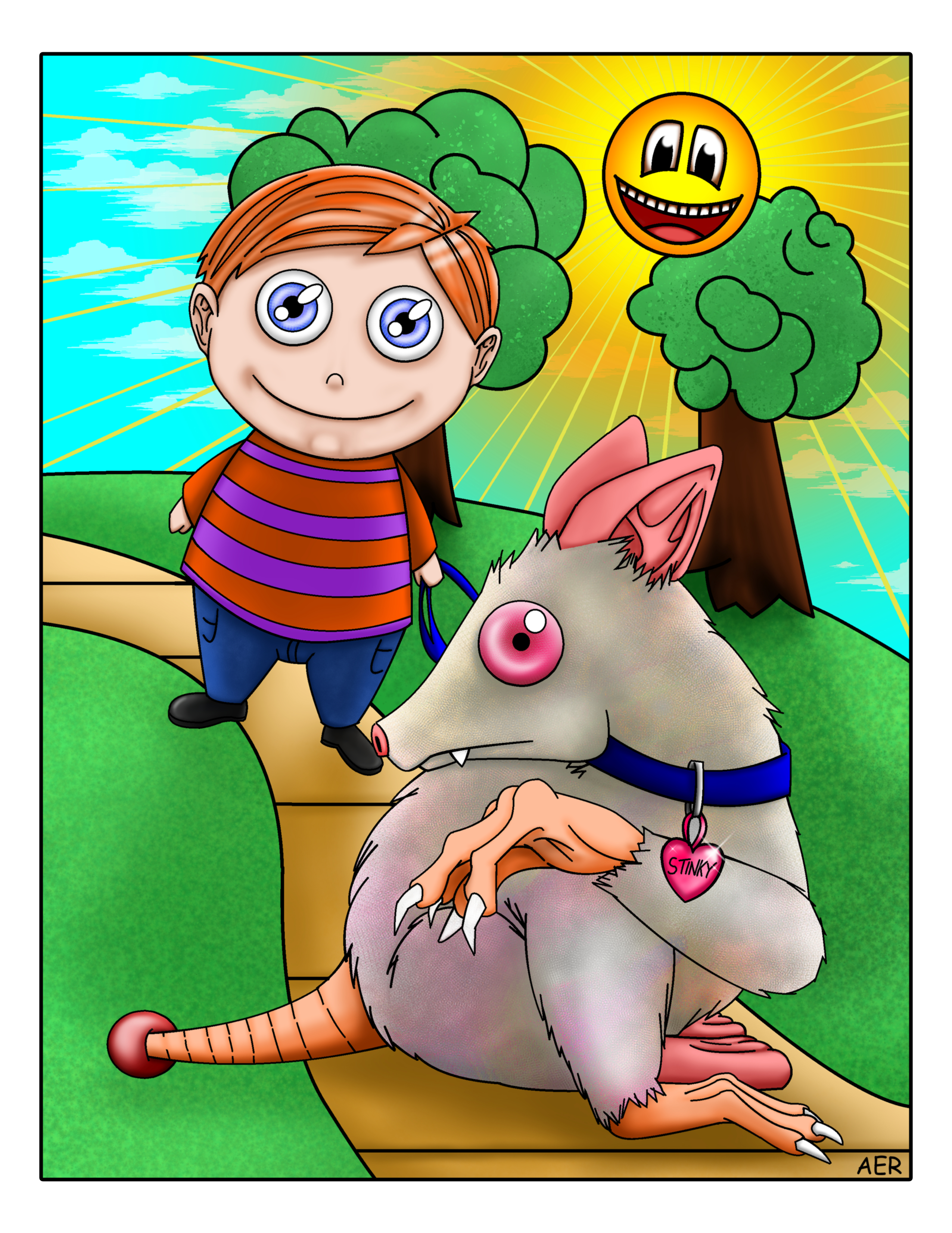
click image
In this order: Add my signature digitally (if needed), flatten all layers, add any borders, and apply a blur to the entire image. For printing reasons I have to ensure that the entire image is at least an eighth of an inch away from the edges, or keep in mind that whatever is that close to the edge might be cut off. It's now finished!
Step 7 - OPTIONAL
Of course if you want to actually print a physical copy there's a few things to keep in mind first.
- Make sure your monitor's brightness level isn't too bright or dark (as stated earlier on this page)
- Convert the color mode in your art program to "CMYK". This will give you a more accurate representation on how it's going to look when it is printed. If you don't convert it, the printing company you chose to print your work will most likely automatically convert it anyway.
- (as stated earlier) Ensure that the entire image is at least an eighth of an inch away from the edges, or keep in mind that whatever is that close to the edge might be cut off.
- For images saturated in color I recommend getting them printed on "cardstock" paper at 65lbs.
☝Tip: Want a physical print? CMYK mode. Want to keep it digital? RGB mode